FP TrendingAug 04, 2021 19:31:40 IST
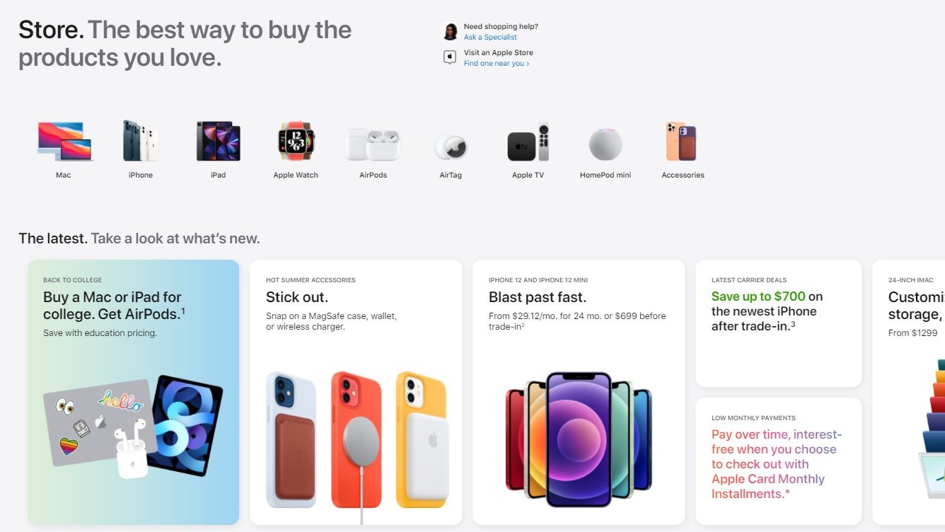
After taking its app store down mysteriously for an hour on Tuesday, Apple reintroduced it with a brand-new appearance, along with a dedicated tab on the company’s top-level navigation. The new look of the Store is similar to Apple’s Store app for iOS.
The redesigned Apple app store is full of cards, and has a rather mobile-first feel to it, making for smooth scrolling on a phone, but it’s not quite as silky on a desktop/laptop. The redesigned store has images and links to Apple’s product lines (Mac, iPhone, AirPods, etc.) on the top of the store. Some links direct you to the new dedicated store product pages indicating availability, along with useful resources such as shopping guides, accessories and support.
The main store page has sections for what’s new, links to support pages and more. Pages that direct to user purchases remain unchanged.
The look of the store is said to have been refreshed in anticipation of the arrival of the company’s rumoured new lineup that includes the iPhone 13, new AirPods and new MacBook Pros.

Post a Comment