Please disable your adblock and script blockers to view this page
February 2019

Simplicity is over-rated, or at least, that’s what USB-IF appears to think. USB-IF is the industry body that defines USB nomenclature and specifications. For some reason that makes no sense to us mortals, they seem to have made it their mission to completely muddle up USB specifications in the consumer world.

See, things were much simpler before. You had USB 1.1, USB 2.0 and USB 3.0. Clearly, the USB version with a higher number was better. Rather than continue that trend, USB-IF then introduced USB 3.1 and muddled things up. Then they decided that things weren’t confusing enough and introduced USB 3.2 and made everything worse.

The humble USB port is now part of a convoluted new world order.

The humble USB port is now part of a convoluted new world order.

But wait, am I going too fast? Let’s start at the beginning.

First, there was this:

  • USB 1.1 (Full Speed): 12 Mb/s
  • USB 2.0 (High Speed): 450 Mb/s
  • USB 3.0 (SuperSpeed): 5 Gb/s

Simple, straightforward and easy to understand.

This was then modified as follows:

  • USB 3.0 became USB 3.1 Gen 1: 5 Gb/s
  • USB 3.1 Gen 2 (SuperSpeed USB 10 Gbps): 10 Gb/s

Uh, sure, but couldn’t they just have gone with USB 3.1 for 10 Gb/s?

And now it’s become:

  • USB 3.0, formerly USB 3.1 Gen 1, is now USB 3.2 Gen 1: 5 Gb/s
  • USB 3.1 Gen 2 is now USB 3.2 Gen 2: 10 Gb/s
  • USB 3.2 Gen 2×2 (SuperSpeed USB 20Gbps): 20 Gb/s

Wha… ? Why? What purpose does this serve?

Y u do dis, USB-IF?

How about a simpler picture? Couldn’t USB-IF have just gone with this instead of sowing confusion?

  • USB 1.1: 12 Mb/s
  • USB 2.0: 450 Mb/s
  • USB 3.0: 5 Gb/s
  • USB 3.1: 10 Gb/s
  • USB 3.2: 20 Gb/s

This is neat, simple, poetic even.

To add to this confusion, you also have the issue of USB ports. The USB-A port is the port we’re all familiar with. This port, however, supports everything from USB 1.1 to USB 3.2 Gen 2×2.

Then there’s USB-C, which Apple loves, which phones are now embracing, and which is reversible. This port can also support everything from USB 1.1 to USB 3.2 Gen 2×2 and, as a bonus, Thunderbolt 3 (Either 10 Gbps or 20 Gbps). And if that wasn’t confusing enough, Thunderbolt 3 is not the same as USB 3.2 Gen 2 or USB 3.2 Gen 2×2.

Gah!

Tech2 is now on WhatsApp. For all the buzz on the latest tech and science, sign up for our WhatsApp services. Just go to Tech2.com/Whatsapp and hit the Subscribe button.

WordPress release cycles may soon take a more predictable cadence, as contributors are considering moving to a time-based approach. The discussion began during a recent core dev chat in mid-February when Gutenberg phase 2 lead Riad Benguella proposed the project move to shorter, automated release cycles.

The Gutenberg team has successfully been releasing a new version of the plugin every two weeks on schedule and any features that aren’t ready are postponed to the next releases automatically. Benguella contends that this type of release schedule has the potential to bring several benefits to WordPress:

  • Less stress for contributors
  • Predictability: People can plan around the release timelines easily
  • No delays as releases are not feature-based

Shortening major releases may prove more challenging for WordPress, which is at a much larger scale than the Gutenberg plugin. The plugin also has the added advantage of being able to manage releases and development on GitHub.

“I think there are a lot of infrastructure problems that need to be solved for WordPress before we could move to a fast, automated release cycle,” Gary Pendergast said.

“Having a major release once a month is achievable, it’s something I’d like us to get to, but the release process is too manual to have multiple releases running at the same time at the moment.”

Jonathan Desrosiers drafted a proposal that summarizes this discussion and outlines some of the manual tasks required for getting a major release out the door. These include time-consuming tasks like Trac gardening, creating a Field Guide, blog posts for the betas, RCs, and official release, documentation updates, videos, dev notes, and other items that are often completed by volunteers.

The 3-4 month release cycles that WordPress had from versions 3.9 – 4.7 allowed for all of the administrative overhead outlined above to be completed in a reasonable amount of time, but the general consensus is that some of these tasks could be more simplified and/or automated.

Desrosiers highlighted several benefits of moving to a shorter major release cycle, including less drastic change for users that might ultimately result in more users being comfortable enabling automatic updates for major releases. Detriments to shortening the release cycle are the increased burden it puts on volunteers as well as theme and plugin developers who need to push compatibility releases. It would also introduce more backporting work for security releases.

Several contributors have left feedback on the post with insight gleaned from other projects’ release scheduling. Jeremy Felt reviewed Firefox’s release owner table that assigns leadership and dates for several releases in advance.

“I think getting to a shorter release cycle in general will involve scheduling multiple releases and assigning their release leads in advance,” Felt said. “So far most of our scheduling is done as soon as the last release has been shipped.”

Joe McGill examined VS Code’s development process and found several similarities to the process he thinks WordPress could adopt in the future:

  1. A long term roadmap (theirs is 6–12 months) outlining major themes and features.
  2. A monthly release cadence based on 4 week sprints which begin with milestone planning and always results in a release of whatever was completed in that monthly iteration.
  3. Regular project triage, with release priorities managed at the team (i.e. Component) level.
  4. Documentation integrated into the development process.
  5. Automated testing of releases and upgrades.
  6. Only important regressions and security issues are handled in minor releases between monthly milestones, everything else is moved forward to the next release (or reprioritized in the backlog).

Several of these points echo feedback from other contributors who have identified documentation integrated into development and automated testing as ways to speed up major release cycles.

“If we don’t have the infrastructure and tooling to support a 1 month cycle, then I think we could attempt a 2 month cycle with a goal towards moving to shorter cycles,” McGill said.

The Gutenberg plugin’s relentless pace of iteration and predictable release cycles have opened up a world of new ideas for improving the process for WordPress core. Discussion around moving the project to shorter, time-based release cycles is still in the preliminary stages. No major changes have been agreed upon yet, but the process of exploring different ideas has put the spotlight on tasks that could afford to be tightened up in the release process. This falls in line with WordPress’ 2019 theme of “tightening up.”

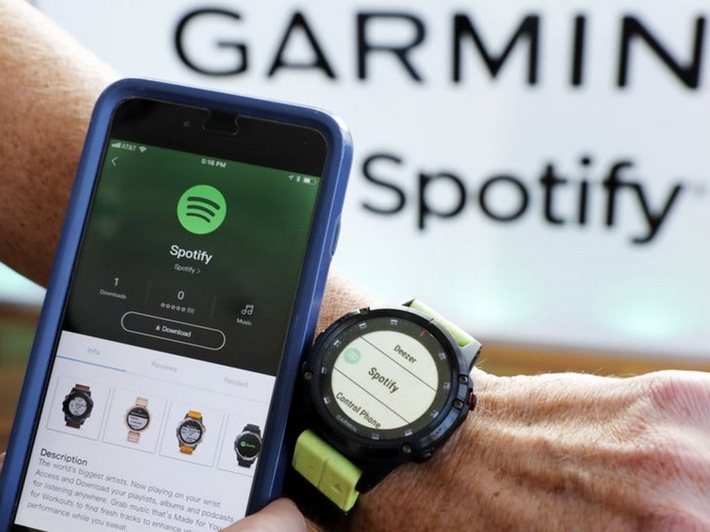
It’s official, Spotify is now available in India!

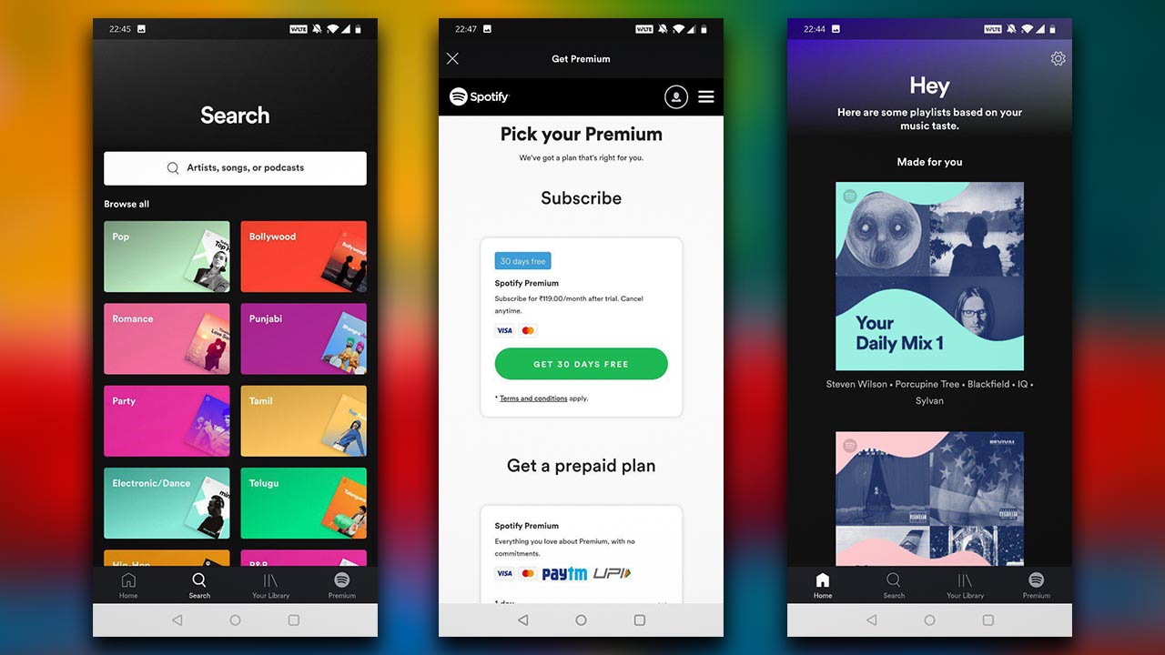
While Spotify is free to use as a streaming music service, it’s an ad-supported service that restricts the quality of the music. It also places restrictions on how you listen to music. To take full advantage of Spotify, you need a Premium subscription, which offers features like the ability to download music, no ads, unlimited skips and more. The pricing tiers for this service in India are as follows:

  • One day: Rs 13
  • Seven days: Rs 39
  • One month recurring: Rs 119
  • One month prepaid: Rs 129
  • Three months: Rs 389
  • Six months: Rs 719
  • One year: Rs 1,189

Students get a 50 percent discount on a monthly subscription. You also get a month of Premium for free and after that, you pay Rs 119 a month.

All things considered, these prices are competitive with music streaming services in India, including Apple Music.

Music lovers are partial to spotify for its unmatched recommendation engine and great UI.

Music lovers are partial to spotify for its unmatched recommendation engine and great UI.

Why Spotify?

In a market flooded with music streaming services like Amazon Prime Music, JioMusic, Gaana, Apple Music and more, Spotify could stand out for its rock-solid recommendation engine and track selection, which are its key strengths in foreign markets. The interface is also friendlier than that of many other services. Spotify also integrates support for podcasts. Hopefully, it can emulate that same experience in India.

Legal troubles

Speaking of track selection, Spotify is in a bit of a legal pickle as it is currently being sued by Warner Music Group. The group, which comprises artists like Ed Sheeran, Madonna, Led Zeppelin, asked an Indian court to block Spotify from streaming songs from artists on the group’s roster.

Pricing for Spotify Premium is set at Rs 129 per month.

Pricing for Spotify Premium is set at Rs 129 per month.

According to Bloomberg’s report on the matter, Spotify doesn’t actually have a license to stream Warner Group’s music, but intends to do so anyway by taking advantage of an ancient (relatively speaking) Indian law that lets broadcasters (like FM radio services) to license copyrighted content without the consent of the original copyright holder.

A report in The Verge indicates that while Spotify is taking advantage of the law, it has launched in India without the Warner catalogue. If Spotify streams music from the catalogue, it will have to track usage and calculate royalties for Warner Music Group and potentially pay the group once the court case is resolved.

How to use Spotify in India

Whether you’re on iOS or Android, simply head to your respective app store and download the app. The installation is straightforward and you’ll be asked to sign up to the service. You can sign up using Facebook (Tech2 suggests you don’t!) and via email.

Android users can subscribe to Spotify Premium via their phones, but iOS users will need to use the Spotify website to sign in and subscribe to the service. Spotify, like Netflix, is trying to wean iOS users away from App Store-based payments over royalty issues.

Android users can simply pay via Visa, MasterCard or Bhim/UPI. Website users are limited to Visa and Mastercard for now.

Tech2 is now on WhatsApp. For all the buzz on the latest tech and science, sign up for our WhatsApp services. Just go to Tech2.com/Whatsapp and hit the Subscribe button.


Samsung Officially Launched Galaxy A10

Samsung announced Galaxy A10, coming with 6.2 inch infinity V display and running on Android Pie OS.

New Samsung Galaxy A10 will be available in three colours Blue, Black and Red. It will come around mid of March 2019 along with Galaxy A30 and Galaxy A50.

Features:

  • Display: 15.80cm (6.2″) HD+, Infinity-V
  • Camera: Rear 13MP (F1.9) | Front 5MP (F2.0)
  • Memory: 2GB | 32GB 
  • Expandable up to 512GB
  • Processor: Exynos 7884, Octa-Core
  • Battery: 3400mAh
  • Operating System: Android Pie, Samsung One UI

Price will be $280 around 19,990 INR.

Xiaomi launched a host of products at its Redmi Note 7 series launch event in India today. Besides announcing the global debut of the 48 MP camera smartphone Redmi Note 7 Pro, the Chinese OEM has introduced the Mi TV 4A Pro 32 and Mi Sports Bluetooth Earphones Basic.

Xiaomi Mi TV 4A Pro 32 with Chromecast built-in launched at Rs 12,999

Xiaomi Mi TV 4A Pro 32 with Chromecast built-in launched at Rs 12,999

The Mi TV 4A Pro 32 has been launched for a price of Rs 12,999, while the new Mi Sports Bluetooth Earphones Basic tags a price of Rs 1,499.

Here are the features, specification, and availability details of the Xiaomi Mi TV 4A Pro 32 and Mi Sports Bluetooth Earphones Basic.

Xiaomi Mi TV 4A Pro: Features, price and availability

Xiaomi just last month brought Mi LED TV 4A Pro 43 and it has now added a 32-inch model to its Mi Smart TV 4A Pro series. Speaking of the features, the Mi TV 4A Pro 32-inch sports an HD display with a 178-degree viewing angle, and 1366 x 768 pixel resolution. The LED TV has 6.5ms dynamic response. It is powered by a quad-core Amlogic Cortex-A53 processor paired with 750MHz Mali-450 MP3 GPU. The new Mi LED TV 4A Pro 32 includes 1GB of RAM and 8GB eMMC internal memory.

It runs PatchWall based on Android 8.1 Oreo.The new Mi TV claims to have Chromecast built-in and Google Play access. It has two 10W stereo speaker. Connectivity suite on the TV include — WiFi 802.11 a/b/g/n (2.4 GHz), three HDMI (one with ARC support) ports, two USB ports and a 3.5mm jack. The HD-ready MI Smart TV supports MPEG1/2/4, REAL,H.265,H.264 video decoder.

The all-new Xiaomi Mi TV 4A Pro 32 will be available for purchase via the company’s official online store mi.com, Mi Home Stores and e-commerce platform Flipkart from 7 March.

Xiaomi Mi Sports Bluetooth Earphones Basic: Features, specs

As for the Xiaomi Mi Sports Bluetooth Earphones Basic, this wireless Mi earphones supports Bluetooth version 4.1 and has a range of ten metre. It features IPX4 rated splash and sweat proof resistant. The new Mi Bluetooth earphones claim to offer nine hours of battery life on medium volume.

It has an in-line smart remove and mic (MEMS siliconn microphone) and multi functional three button design. The Mi Sports Bluetooth Earphones Basic carries a 120 mAh battery that is rated to deliver 260 hours standby time and two hours of charging time. The earphones bundle five sizes of silicon buds. The new Mi Sports Bluetooth Earphones Basic will be available for pre-orders from 5 pm today. However, Xiaomi has not shared any detail regarding the release date of its new Mi Bluetooth earphones.

Tech2 is now on WhatsApp. For all the buzz on the latest tech and science, sign up for our WhatsApp services. Just go to Tech2.com/Whatsapp and hit the Subscribe button.

Gatsby WordPress Themes is a new collaborative project led by Zac Gordon with help from Jason Bahl, Rich Tabor, Muhammad Muhsin, and Alexandra Spalato. The group is working together to port popular themes for use with Gatsby, the React-based static site generator that uses GraphQL for its data layer.

Known for its performance and ease of deployment, Gatsby has captured developers’ attention and was one of the rising stars of the React ecosystem throughout 2018. Using WordPress as a headless CMS, developers can pull data into Gatsby and enjoy the scalability, speed, and security that comes with serving static files.

Although static site generators have been around for awhile, the current Gatsby craze seems to be rooted in the fact that the project uses React, Webpack, and modern JavaScript and CSS.

“WordPress devs love Gatsby because it lets them throw away the entire old school PHP based WordPress theming system and built sites with React and GraphQL,” Gordon said.

“Gatsby devs are finding a new interest in WordPress because by default you have to edit Gatsby content in Markdown. WordPress gives a much richer editing experience.”

Jason Bahl, creator of the WPGraphQL project, is a technical advisor for the Gatsby WP Themes project. He was inspired to collaborate with the team because he thinks Gatsby has a lot of benefits for WordPress sites.

“The end result of a Gatsby site is a static site with no live Database connection,” Bahl said. “Just HTML and JavaScript files, so performance is better than even the most highly cached WordPress sites, and security is better because there’s no live database connection to be compromised.

“Also, Gatsby is fully React. With Gutenberg in core, WordPress developers are writing a LOT more React. Using Gatsby as the presentation layer for a site allows for components to be re-used across the admin and the theme, where now developers need to create React components for Gutenberg and PHP template partials for the ‘regular’ theme rendering.”

Regular WordPress theme are not immediately compatible with Gatsby, since the entire theme has to be built with React, but developers can use the same styles.

“We are taking a distinctly different direction than the WordPress themes on the Gatsby themes repo currently,” Gordon said. “We are going to base all of our themes on the WP GraphQL plugin. The default Gatsby themes now work on a wrapper on top of the REST API and don’t have live GraphQL endpoints, so they are limited.”

Gatsby WordPress Themes Project Partners with Theme Shops to Offer Free and Commercial Gatsby Themes

The Gatsby WordPress Themes project will offer a combination of free and commercial Gatsby themes. Gordon is partnering with theme shops that are open to his team doing the heavy lifting of porting popular themes over to Gatsby.

“The first two theme partners are Rich Tabor of CoBlocks and ThemeBeans, who is licensing us his super clean and Gutenberg perfect ‘Tabor’ premium theme,” Gordon said. “Then we have Leland Fiegel, a fellow DC WP chap and long time friend, from Themetry. They specialize in themes on WordPress.com, which means they are also battle tested. They have licensed us their great business theme Belmont.”

Gordon said the first versions of the Gatsby themes are targeted towards business and brochure sites that might have a couple pages laid out in Gutenberg and possibly a news/blog section and contact page.

“Since headless sites don’t work with a lot of plugins by default, the V1 of all the themes will be super opinionated and focused (but 100% extendable),” Gordon said.

“The final set of themes are from the WordPress default themes collection. We will have a detailed article showing how we ported the Twenty Nineteen theme over to a Gatsby theme and that will be the first of the default themes we do.”

Although this initiative is aimed at simpler WordPress sites, creating and maintaining a Gatsby site isn’t necessarily going to be well-suited to beginners.

“As far as the target audience, I think any WordPress site that doesn’t have super fast moving content – like the average marketing site or documentation site is perfect for Gatsby,” Bahl said.

“Gatsby does have a ‘Build’ step, where it collects ALL the data needed for the entire site, then outputs the content in the static Gatsby site. So even changing a typo on a post would require the ENTIRE SITE to rebuild, which can take anywhere from a few seconds to several minutes, which may not be acceptable for sites that need content live FAST (like a newspaper).

“But for your average WordPress site, waiting two minutes for your changes to be live in production is acceptable. Many heavily cached WordPress sites already experience a delay in content being live anyway.”

Gordon said he doesn’t believe Gatsby is the right fit for all WordPress sites but for certain projects it “can be a really cool approach both in terms of development experience and gains in speed and security.”

The group is aiming to have its first themes released for WordCamp Miami in mid-March and plans to release more as they make new partnerships and see an actual demand. Gordon is actively looking for more theme shops to bring on board.

“Zac will be primarily maintaining the Gatsby themes, though I’ll help where I’m needed,” ThemeBeans founder Rich Tabor said. “We’re still in the very initial stages of development.

“Overall, it’s a super interesting idea. Static site generators are increasing in popularity and Gatsby is pretty much leading the pack in terms of performance and ease-of-use — both of which WordPress is not particularly well-known for (but is making strides to improve).”

Spotify, one of the most popular music streaming services, has officially launched in India today. It is available on Android, iOS as well as on the web platform.

The freemium streaming service will be available for free starting today. In the case of Spotify, this means that while you can stream content for free, you will have to endure unskippable ads. Also, the option to skip a track you don’t like is only available in the paid version — free users can skip up to 6 tracks a day.

If you’d rather not suffer through that, Spotify is also offering a free, 30-day trial of its Premium tier, which you can then pay for by selecting from one of the following subscription packages:

  • One day: Rs 13
  • Seven days: Rs 39
  • One month: Rs 129
  • Three months: Rs 389
  • Six months: Rs 719
  • One year: Rs 1,189
Headphones are seen in front of a logo of online music streaming service Spotify in this February 18, 2014 illustration picture. REUTERS/Christian Hartmann/File Photo - D1BETHKCBRAA

File photo of Spotify logo. Image: Reuters

In a conference call post the official launch announcement in India, the Spotify India team comprising India managing director Amarjit Batra, head of India marketing operations Akshat Harbola and Spotify’s global director of product Owen Smith, spoke at length. For the purpose of simplicity, quotes would be attributed to the Spotify India team.

Spotify India is official

The Spotify India launch has been speculated for quite a while now. Initially, the launch was scheduled towards the end of last month. Then it was speculated to be delayed to mid-March. But on the night of 26 February, the Spotify app started showing up on Android and iOS app stores.

India already has a lot of audio streaming services including Apple Music, Google Play Music, Amazon Music and local ones such as JioSaavn and Gaana. Spotify is entering a crowded market, so to speak. But according to the Spotify India team, there is still a huge gap to fill in the audio streaming space. When asked who Spotify considers as its main competition, the team didn’t name any of the existing players but instead said that its main challenger was the pirate mindset and it hopes to change that with is freemium offering.

Considering that Spotify has come late to the party, it has taken ample measures to ensure that its offering is localised to Indian tastes. To that effect, Spotify India will have regional language catalogues and its recommendation engine is already active for four Indian languages. India playlists will not be just genre based, but considering the love of films among Indians, playlists according to the actors in those films will also be up from day one.
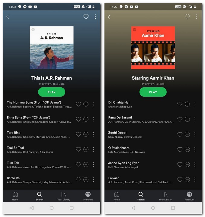
India specific playlists on launch day on Spotify

India specific playlists on launch day on Spotify

Focus on localising content to Indian tastes

“In India, a service that just deals with music artists won’t work. It has to have musicians, films, actors, music according to the varied decades of cinema and so on. The recommendation engine had to adapt to that. We also have in-house curators, who build a host of playlists around films and actors,” said the team as part of its differentiation efforts for India.

According to the Spotify India team, the company could have launched earlier in India, but merely plugging in the international version would be pointless. “We like to look at any market with a local perspective and we pay a lot of attention to local content. We also look at consumer insight. We then go back and improve the product and that takes time,” said the team stating that Spotify would be partnering with a lot of local content creators, independent artists along with brand partnerships.
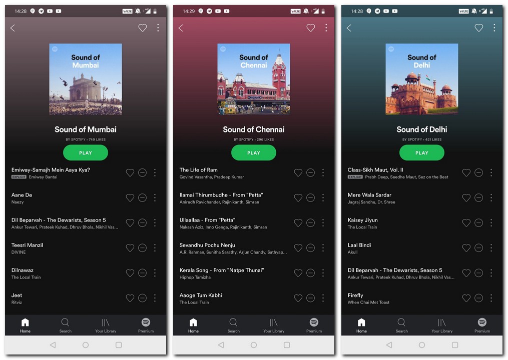
Sound of Cities is a city-based playlist which Spotify will curate for its India users

Sound of Cities is a city-based playlist which Spotify will curate for its India users

Considering a lot of Indian users are still on 2G/3G networks, how would Spotify scale the streaming when you are in a weak network area?

“By default, Spotify streams at 96 kbps for free users. If you are on the Premium plan, you are streaming music at 320 kbps. But at instances where your network strength isn’t too strong, the streaming can happen at 24 kpbs at the minimum,” said the team.

According to a Deloitte report, the music streaming industry will see revenues of Rs 3,100 crore by 2020. Considering Spotify just crossed the 200 million subscriber mark last month, it will be looking forward to a huge growth opportunity in India as well. According to the team, while it is still unpredictable to see how its Premium offering will play out, it still thinks there is enough to get people to subscribe.
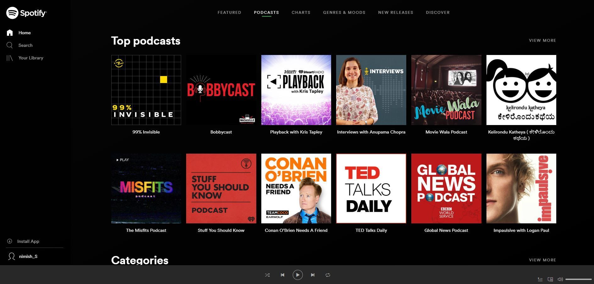
Spotify recently acquired Gimlet and Anchor.fm to boost its podcast efforts.

Spotify recently acquired Gimlet and Anchor.fm to boost its podcast efforts.

“The video OTT space is growing here and people are willing to pay for quality content. That wasn’t the case two years ago. Even payment ecosystems have undergone a sea-change, so we are seeing that also translating into getting users to pay for services online. Spotify’s freemium model has worked in emerging markets abroad and we feel confident that it will work here as well,” said the team.

Spotify would also be looking at working closely with its partners to have data-backed ‘live’ properties. These can either be concerts streamed live on the internet or experiences such as Spotify on Stage. Nothing is concrete yet, but the team said that Spotify would be open to partnering with music festivals in India as well.

Spotify India vs Warner Music Group

The Spotify India launch hasn’t been as smooth as one would have expected. Just a day before its India launch, there was news floating that it was being sued by Warner Music Group. The group, which comprises artists like Ed SheeranMadonnaLed Zeppelinasked an Indian court to block Spotify from streaming songs from artists on the group’s roster. So naturally, some artists are not present on the platform. Also, a lot of the content available on international playlists is coming greyed out for Indian users.

“Spotify is an evolving service and will be working with labels to add more content for Indian users. We will review the gaps and will update those as and when needed,” said the team. This was the standard response on questions around its local podcasts plans for India, family plans for Indian users, Alexa or Google Home integrations and more.

Stiff competition in the audio streaming space

The anticipation for the Spotify India launch was huge. Now that it has finally launched in India, it has established competitors in the space to deal with. But with other streaming services already having a significant lead in India and some users already having invested in these streaming services with their playlists and music selections, will Spotify be able to convert those users? Or is there a completely new market segment Spotify has its eyes on? It’s too early to opine on that.

(Also Read: Spotify vs Apple Music vs JioSaavn vs Gaana vs Google Music vs Amazon Music: A comparison of services)

But being the first audio streaming service around with a catalogue of 40 mn plus songs and over billions of user-curated as well as algorithmically-created playlists, the recommendation engine of Spotify is surely its USP. How quickly it adapts to local tastes and regional content is what will make it stand out in the crowd.

Disclaimer: JioSaavn is owned by Reliance Industries which also owns Network18, the publisher of Firstpost and Tech2

Tech2 is now on WhatsApp. For all the buzz on the latest tech and science, sign up for our WhatsApp services. Just go to Tech2.com/Whatsapp and hit the Subscribe button.

With the launch of Spotify in India, the music streaming industry in the country sees another worthy competitor entering the fray. Already with the likes of Apple Music, Gaana, Amazon Music, Wynk and more, the streaming space has become quite crowded, and with the merger of Jio and Saavn forming JioSaavn, the Indian audience has a plethora of options to choose from.

Image: AP

Image: AP

Spotify bags the title of the most subscribed music streaming platform in the world, dwarfing industry heavyweights such as Apple, Google, Gaana and JioSaavn. The main attraction to Spotify is its ease of use, elegant UI and a great list of curated playlists. Licensing problems aside, Spotify boasts of a massive music collection, which was more is more than 40 million in 2018, although the company has declined to give an official number.

However, in a market as diverse as India, Spotify will find it difficult to serve everyone in a country as diverse as India. Apps like Gaana and JioSaavn offer music in more than 15 languages while Spotify is bringing up the rear with just content in 7 languages.

One place where Spotify has done well is pricing. Spotify has offered daily, monthly and yearly packs which start from Rs 13, Rs 119 (Rs 129 after the third month) and Rs 1,1189 respectively. There is also a 50 percent student discount available on the monthly subscription package.

These prices are laughable compared to what Spotify charges in the US, which is $10 + taxes for a month (about Rs 800). In India, we see that nearly all competitors are offering around the same price with Gaana and JioSaavn offering the lowest monthly rates of Rs 99.

Whether or not Spotify is a success is something we will see in the long run, but for now, here’s a comparison table which pits Spotify against its counterparts in the Indian market.

Streaming Service Spotify Google Music JioSaavn Amazon Music Gaana Apple Music
Subscriber Count 207 million (paid 97 million) 50 million 100 million 100 million 80 million 56 million
Pricing Rs 13 for 1 day; Rs 119 for 1 month; Rs 1,189 for 1 year Rs 99 for 1 month Rs 5 for 1 day; Rs 99 for 1 month; Rs 999 for 1 year Rs 999 for 1 year (included with Prime) Rs 99 for 1 month; Rs 999 for 1 year Rs 120 for 1 month
Family Plan No Rs 190 (up to 6 people) No No Rs 499 (up to 5 people) Rs 190 (up to 6 people)
Free Features Listen to all tracks with ads after every sixth song Listen to curated playlists, Upload your own music Listen to tracks with ads, Lyrics No Listen to tracks with ads, Lyrics No
Paid Features Unlimited ad-free tracks, unlimited skips, full-range of curated playlists, Download songs offline, HD Audio Unlimited ad-free tracks, full-range of curated playlists, YouTube Music, Unlimited Radio, Download songs offline Unlimited ad-free tracks, Download songs offline, HD Audio Unlimited ad-free tracks, Download songs offline, HD Audio Unlimited ad-free tracks, Download songs offline, HD Audio Unlimited ad-free tracks, Download songs offline, HD Audio
Max Devices 5 10  TBC  TBC 5 6
Offline downloads 10,000 50,000 Unlimited Unlimited Unlimited Unlimited
Music Collection 40 million 40 million 45 million 40 million 45 million 50 million
Android/iOS/Desktop app Yes Yes (No official desktop app) Yes Yes Yes Yes (via iTunes on desktop)
Maximum Streaming bitrate 320 kbps (mp3,Premium); 96 kbps (Free, mobile); 160 kbps (Free, PC) 320 kbps (AAC,all) 320 kbps (NA,Premium); 160 kbps (Free) 320 kbps (NA) 320 kbps (NA,Premium); 160 kbps (Free) 256 kbps (AAC)
Free trial period 30 days 30 days 90 days No 30 days 90 days
Podcast support Yes Yes No Yes No Yes
Languages 7 NA 15 10 21 NA

Tech2 is now on WhatsApp. For all the buzz on the latest tech and science, sign up for our WhatsApp services. Just go to Tech2.com/Whatsapp and hit the Subscribe button.

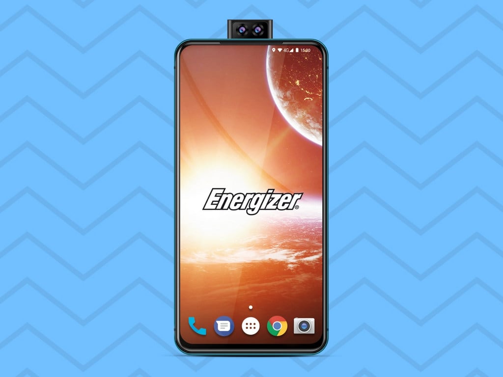
Move over from 3,000 mAh and 5,000 mAh battery phones. At the Mobile World Congress 2019, Energizer announced and showcased a smartphone which looks more like a laptop power adapter with a display on it.

This year’s edition of MWC which has been full of foldable phones and the Energizer Power Max P18K Pop looks anything but slick and elegant. How thick is it really? Well, as per a report by The Verge, the smartphone is an 18 mm (almost 2 centimetres) thick slab.

The Energizer Power Max 18K Pop

The Energizer Power Max 18K Pop

France’s Avenir Telecom, which licenses the Energizer brand, promises a week’s worth of use, or two full days of continuous video playback for that gargantuan battery. At last year’s edition of MWC, Energizer showed off the Power Max P16K Pro, which featured a 16,000 mAh battery. With the successor, the firm has decided to up the power (and the thickness).

Although the 18,000 mAh battery supports fast charging, it would take you eight hours to charge it to full. Despite the rough edges, the Energizer Power Max P18K Pop will be the phone with the biggest battery in the world when it launches in the summer.

As for specifications, the Energizer Power Max P18K Pop features a 6.2-inch LCD display, triple cameras at the back, and runs on the latest version of Android 9 Pie. The phone also features dual pop-up cameras. It is powered by a MediaTek Helio P70 processor, 6 GB of RAM and 128 GB of internal storage.

Ignoring how obnoxiously thick the phone looks, it has minimal bezels and no notches or cutouts and actually doesn’t look bad at all if you’re looking straight at it. In fact, it isn’t a surprise that the only official image shared by the brand on the internet is a render shot from a point blank range.

For all the latest updates from the Mobile World Congress 2019, please head to our MWC 2019 page

Tech2 is now on WhatsApp. For all the buzz on the latest tech and science, sign up for our WhatsApp services. Just go to Tech2.com/Whatsapp and hit the Subscribe button.


Google Duo Video Chat Is Now Available in Web Version 

Just go to Google Duo website and make calls directly on your desktop without having to use your smartphone device. Google Duo is One to one Video calling service.

Google Duo is a video chat mobile app developed by Google, also available on the Android and iOS operating systems. It was announced at Google’s developer conference on May 18, 2016, and began its worldwide release on August 16, 2016. Google Duo lets users make video calls in high definition.

Now use Google Duo for the web on Google Chrome, Firefox, or Safari, aside from Android and iOS devices. But opera is not supported yet.

Now, in order to start using the live service, you’ll have to log into your Google account, but that completely removes the need to authenticate via a phone number or QR code scan.

By Haider Ali Khan Tuesday, January 15, 2019

Ever since the first iPod was released back in October of 2001, the tech-industry has never been the same. Especially not for Apple. It has been one of Apple’s most revolutionary products to date. Yet the portable music player hasn’t seen a new release in more than 4 years. This however could soon be changing. Rumours suggest that the iPod Touch might soon be getting a 7th-Genartion model.

Japanese tech-based news website MacOtakara have been informed at CES 2019 by suppliers that the iPod Touch 7th Generation is under development and will most likely see a release date later this year.

The last variant of the iPod Touch (the 6th-Gen) was released in July of 2015, and it was updated with the latest at-the-time A8 microprocessor chip along-side an optional 128GB storage variant, which is currently priced at $299. The price of the new 7th Gen iPod Touch is still yet unknown but given Apple’s release history, it will probably be in the $200-$500 ballpark with different storage variants being available for buyers to choose from.

Any more information regarding the new device has not yet been specified. However, it is a given that they will be implementing a much faster chip from their A-series bundle. Additionally, an improved camera and better audio output will definitely be on their list of features to add upon on their latest release.

The MacOtakara rumours also suggest that Apple will be switching to USB-C in 2019 and will implement it in any and all 2019 iPhone releases. Change is not uncommon to Apple users, however the change to USB Type-C from the company’s famous lightning port may see both negative and positive reaction from Apple users. Additionally, this begs the question on whether or not they will be doing the same for the 7th Gen iPod Touch.

There are plenty of options for Apple to choose from when it comes to how they want to upgrade their iPod family, and if rumours are to be true, then Apple fans and iPod users alike will either be in for a treat, or a disappointing surprise, with the release of a brand new iPod Touch later on this year.

WhatsApp’s search feature isn’t the most polished out there and if you’re someone who uses WhatsApp to converse on groups with hundreds of chats every day, it does become extremely difficult to look for something specific.

In the past few weeks, the WhatsApp team has been trying to polish its in-app search feature with a number of discreet changes under the hood, but a bigger feature may be in the works.

WhatsApp for iOS. Reuters.

WhatsApp for iOS. Reuters.

As per a report by WABetaInfo, the popular messaging service has begun work on a new ‘Advanced Search’ feature for users. The feature is currently under development for iOS, but sources closely tracking progress do state that the feature will be rolled out to Android users as well.

The report, however, states that the feature is at a very native stage and that for reasons linked to the development of the feature, it may not show up for all iOS beta users right away. The Advanced Search feature could take a few weeks before it sees a wider, stable rollout.

An official beta program for iOS was never available for everyone because it always was restricted to a few users. But WABetaInfo found that WhatsApp had unexpectedly opened its public beta program, making it available to any iOS user for a while.

At the time of writing this report though, the Beta program on Testflight is full.

Tech2 is now on WhatsApp. For all the buzz on the latest tech and science, sign up for our WhatsApp services. Just go to Tech2.com/Whatsapp and hit the Subscribe button.

The new Gutenberg block editor that arrived in WordPress 5.0 is now in beta testing on the mobile apps. The editor will be available in version 11.9, which is planned to be released to the public on March 11.

“For this first version, our main focus was to build a pleasant writing experience with support for the most basic types of content,” WordPress mobile engineer Jorge Bernal said.

“Our data showed that 90%+ of the posts created on the mobile apps consisted of basic text and images, so we decided to focus on supporting the Paragraph, Image, and Heading blocks on this version.”

The interface looks similar to using Gutenberg on desktop, but it has been pared back to allow for only the most commonly used blocks and access to simple block settings.

Block editor v1 0 demo FINAL 2019 02 26 08 29 03

The block editor in the Android app feels noticeably slower on mobile than the previous editor. It’s not yet an improvement on the existing mobile editor but it’s still in beta. Even though it’s still rough around the edges, the posting interface is more consistent with what users experience on the desktop. During this transition time, users will retain the ability to use either editor, since the Gutenberg implementation just provides the basics for now.

After version 11.9 rolls out to the apps, users can choose if they want to use the block editor. The app detects which editor a post was created with and will automatically open it when a user attempts to edit a post. Users can manually switch back to the old editor for posts that have blocks by selecting “Switch to Classic Editor” under the ellipses menu. New posts will still use the Classic Editor by default but users can change the default to the block editor by going to Me > App Settings and enabling the “Use Block Editor” option.

After 11.9 is released the team plans to work on UX improvements and bug fixes before moving on to add support for the most common blocks and use cases.

Swatch Group has filed a complaint against Samsung Electronics Co and Samsung Electronics America Inc, saying the two companies infringed upon its trademark on designs for downloadable smartwatch faces.

The Swiss watchmaker said the South Korean companies’ watch faces “bear identical or virtually identical marks” to the trademarks it owns and uses on its brands which include Longines, Omega, Swatch, and Tissot.

The logo of Swiss watchmaker Swatch is pictured on a shop in Geneva, Switzerland, February 9, 2018. REUTERS/Denis Balibouse - RC1E88B8A260

The logo of Swiss watchmaker Swatch is pictured on a shop in Geneva, Switzerland. Reuters

“This unabashed copying of the Trademarks can have only one purpose – to trade off the fame, reputation, and goodwill of the Swatch Group Companies’ products and marks built painstakingly over decades,” Swatch Group said in a filing to the US District Court for the Southern District of New York.

Swatch has demanded a trial in the complaint which also alleges unfair competition and unfair business practices and is seeking more than $100 million in damages.

It said it had launched the action in the United States because that was where its trademarks were registered and where apps for Samsung’s Gear Sport, Gear, S3 Classic and Frontier watches could download watch face designs that infringed its trademarks.

“This is a blatant, willful and international violation of our trademarks by Samsung,” a Swatch spokesman said.

“The affected brands are worth billions. Our claim for compensation? Triple digits in millions.”

Samsung declined to comment.

Tech2 is now on WhatsApp. For all the buzz on the latest tech and science, sign up for our WhatsApp services. Just go to Tech2.com/Whatsapp and hit the Subscribe button.
If your high-end Android phone allowed you to capture amazing pictures but the storage always disappointed you, SanDisk has just answered all your prayers.

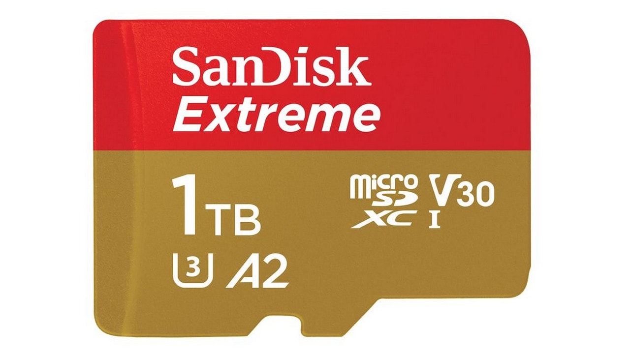
At the ongoing Mobile World Congress (MWC 2019) in Barcelona, the company introduced the world’s first 1 TB microSD card.

The SanDisk Extreme UHS-I microSDXC. Image: SanDisk

The SanDisk Extreme UHS-I microSDXC. Image: SanDisk

Aimed at the current generation of smartphones which boast multiple cameras and high-resolution video capturing, but lack sufficient in-built storage options, the 1TB SanDisk Extreme UHS-1 microSDXC card is claimed to feature higher speed and capacity for capturing and moving massive amounts of high-quality photos and videos on smartphones, drones and action cameras.

The 1TB microSD card reaches speeds of up to 160 MB/s. You can now transfer files in nearly half the time over standard UHS-I microSD cards available in the market.

The 1TB SanDisk Extreme UHS-1 microSDXC card is up for pre-order on the SanDisk website and will be available at select retailers in April 2019. It will cost $499.99. There’s also a 512GB capacity available for the SanDisk Extreme card, priced at $199.99.

Tech2 is now on WhatsApp. For all the buzz on the latest tech and science, sign up for our WhatsApp services. Just go to Tech2.com/Whatsapp and hit the Subscribe button.

Comparison Between Galaxy Fold And Huawei Mate X

The following comparison between recently launched smartphones Galaxy Fold and Huawei Mate X.
Last week Samsung and Huawei have launched Galaxy Fold and Mate X foldable smartphone devices. It can unfold from pocket size into a Table screen.

<![CDATA[]]>

Galaxy Fold Huawei Mate X
Pricing $1,980 $2,600
Dimensions Not available 146.2 x 161.3 x 11mm (5.76 x 6.35 x 0.43 inches)
Weight Not available 295g (10.41 ounces)
Screen size Main: 7.3 inches (185.42mm) 8 inches (203.2mm)
Cover: 4.6 inches (116.84mm)
Screen resolution 2,152 x 1,536 (414 ppi) 2,480 x 2,200 (414 ppi)
Screen type QXGA+ Dynamic AMOLED OLED
Battery 4,380 mAh 4,500 mAh
Internal storage 512 GB 512 GB
External storage None NM card
Rear camera(s) Triple camera: Wide angle, 40MP
Telephoto, 12MP, f/2.4, 1.0µm Ultra wide angle, 16MP
Wide angle, 12MP, f/1.5 / f/2.4, 1.4µm Telephoto, 8MP
Ultra wide, 16MP, f/2.2, 1.0µm
Front camera(s) Dual camera: None
Selfie, 10MP, f/2.2, 1.22µm
Depth, 8MP, f/1.9, 1.12µm
Cover camera Selfie, 10MP, f/2.2, 1.22µm None
Video capture 4K at 30fps 4K at 30fps
SoC Qualcomm Snapdragon 855 Huawei Kirin 980
CPU 2.84GHz octa-core 2.6GHz octa-core
GPU Adreno 640 Mali-G76
RAM 12 GB 8 GB
WiFi Dual band, 802.11ac Dual band, 802.11ac
NFC Yes Yes
Bluetooth v5.0 v5.0
Operating system Android 9.0 Android 9.0
Other features WPC / PMA wireless charging, USB-C USB-C
Overall we would like to go for Galaxy Fold as comparison Huawei Mate X because its feature is better.

BlackBerry launched the Key2 back in July last year, a smartphone with a bunch of extra security enhancements for business users paranoid of others snooping into their data.

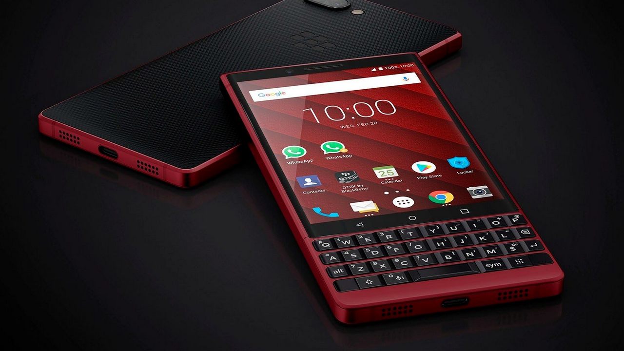
Close to nine months later, BlackBerry has announced a bright red variant of the phone at MWC with 128 GB of storage which is double of that on the original. However, nothing else has really changed here from the original Key2, which had disappointing specs for the price, to begin with.

Blackberry Key2 Red Variant. Image: BlackBerry

Blackberry Key2 Red Variant. Image: BlackBerry

The bright red BlackBerry Key2 comes with a 4.5-inches LCD display with a resolution of 1080 x 1620 pixels and an aspect ratio of 3:2. It weighs 156 grams and features the classic BlackBerry keyboard of yesteryear with a touch-sensitive top or easier navigation.

Inside, the BlackBerry Key2 is powered by a Qualcomm Snapdragon 660 SoC and comes with 6 GB RAM as standard. The phone also features what BlackBerry likes to call “Speed Key”, a universal shortcut key that makes it possible to instantly access apps, contacts and functions.

The new bright red Key2 also features last year’s Android 8.1 Oreo Operating System which is quite disappointing. For optics, the phone features a 12 + 12 MP dual rear camera system with 2x optical zoom, an 8 MP front camera for selfies. The unit is powered by a 3,500 mAh battery with QuickCharge 3.0 support.

The new red Key2 will cost you $749 (approximately Rs 53,200) which is considerably higher than the regular Key2 which costs Rs 42,990. Would you spend roughly an extra Rs 10,000 on a new colour and 64 GB of additional storage? Maybe not.

Please head to our MWC 2019 page for all news related to the event.

Tech2 is now on WhatsApp. For all the buzz on the latest tech and science, sign up for our WhatsApp services. Just go to Tech2.com/Whatsapp and hit the Subscribe button.

For Wednesday’s iLounge Deal, you can pick up a one-year subscription to Truebill Premium for only $19.99 — that’s 44% off the regular price. This personal finance control center makes it easy to optimize your spending, manage your subscriptions, and lower your bills, helping you keep on top of your financial life and expenses. Using bank-level security with 256-bit SSL encryption and read-only access, Truebill connects to your accounts and gives you a complete picture of your finances. You can easily view your cash, credit, and investment balances; and Truebill even helps negotiate lower rates for your cellphone, cable, security and other bills!

Get a one-year subscription to Truebill Premium now for only $19.99

Sony usually announces its entire Xperia smartphone lineup at MWC and this year’s been no different. In a bid to win back some of its lost significance as a smartphone brand, the Japanese company’s launched three new smartphones — the premium Xperia 1 and the Xperia 10 and the Xperia 10 Plus.

The Sony Xperia 1. Image: Sony

The Sony Xperia 1. Image: Sony

Xperia 1: Price and Specifications

Sitting right at the top of the pile of Sony’s premium smartphone offerings for 2019 is the Xperia 1. Sony changed its naming scheme a little bit because it was clearly becoming difficult for users to keep track.

The highlight of the Xperia 1 is definitely its display. The phone gets a 6.57-inch 4K HDR OLED display, the first on any smartphone. Sony’s also tinkered around with the aspect ratio to what the company calls a CinemaWide aspect ratio of 21:9. This aspect ratio is an approximation of several ultra-widescreen aspect ratios (including 64:27, 43:18 and 12:5) and is designed to show films recorded in CinemaScope of 2.35:1 or the modern anamorphic format of 2.39:1.

Having this ultra-wide aspect ratio, however, does make the phone much taller, making it look a little odd compared to regular smartphones with a 19:9 aspect ratio. There’s no notch here, but there is a sizable top bezel which makes the phone even taller. Sony’s also draws on its Bravia TV tech to improve overall contrast, colour and clarity of content displayed along with support for DCI-P3 and IT-R BT.2020 colour spaces.

The 21:9 aspect ratio display on the Sony Xperia 1. Image: Sony

The 21:9 aspect ratio display on the Sony Xperia 1. Image: Sony

Leveraging its studio arm, Sony Pictures Entertainment (the company responsible for movies such as SpiderMan, Men In Black and many others), the company promises to bring films and TV shows shot in native 2.29:1 to the Xperia 1 without wasting screen space on black empty bars. Sony’s also worked with a bunch of big game developers such as Epic Games, Gameloft and Tencent to optimise mobile titles like Fortnite, Asphalt 9, and Arena Valor to run on the Xperia 1 at its native 21:9 ratio.

The camera hardware is no slouch either. The Xperia 1 packs a triple-rear camera setup with all three sensors being 12 MP lenses, but each having a different function. There’s the primary 26 mm wide lens with OIS, a 52 mm telephoto zoom lens with OIS and a 16 mm superwide lens. On the front, there’s an 8 MP f/2.0 shooter for selfies.

As far as video recording capability is concerned, the Xperia 1 capable of recording 4K HDR videos, with Sony’s Bionz X image engine taking care of the processing. For those who care, that’s the same chip inside Sony’s Alpha a99 II SLR and the RX100 III point-and-shoot. There’s also Cinema Pro mode, which lets users shoot 4K HDR video in a 21:9 ratio. This is a 24-frames-per-second shooting mode with eye-level tracking autofocus support and auto exposure tracking.

The triple 12 MP camera setup on the Xperia 1. Image: Sony

The triple 12 MP camera setup on the Xperia 1. Image: Sony

Inside, the processing workload is handled by the Qualcomm Snapdragon 855 SoC along with 6 GB of RAM and 128 GB of storage which is further expandable up to 512 GB. There’s no headphone jack and for a phone with such a large display, it’s got only a 3,330 mAh battery unit which is a tad worrying.

The Xperia 1 will be available for sale in late spring and will be sold in two colours — black and purple, followed by two more colours — grey and white being added to the mix soon after.

Xperia 10 and Xperia 10 Plus: Price and Specifications

The Xperia 10 and 10 Plus are mid-ranged offerings from Sony. These two phones aren’t new additions to the Xperia lineup though and are rather direct successors to the Xperia XA2 and the XA2 Ultra.

As the name suggests, the 10 Plus is the larger of the two phones, but they do have a lot in common otherwise. The Xperia 10 features a 6-inch FHD+ LCD display, while the 10 Plus gets a 6.5-inch LCD unit. Both phones feature the same CinemaWide 21:9 aspect ratio. The other difference between the Xperia 10 and the Xperia 1 is that the latter gets Corning’s Gorilla Glass 6 protection while the 10, 10 Plus comes with Gorilla Glass 5 protection.

Sony Xperia 10 and 10 Plus. Image: Sony

Sony Xperia 1, 10 and 10 Plus (L to R). Image: Sony

For cameras, both the Xperia 10 and 10 Plus feature a dual-rear camera setup with a 13 MP primary sensor and a 5 MP secondary sensor on the Xperia 10, as opposed to a 12 + 8 MP setup on the Xperia 10 Plus. On the front, there’s a standard 8 MP selfie shooter on both the phones.

Inside, the Xperia 10 Plus features a Qualcomm Snapdragon 636 SoC with 4 GB of RAM, while the Xperia 10 gets a slightly weaker Snapdragon 630 SoC with 3 GB RAM. Both phones pack 64 GB of internal storage, expandable up to 512 GB via a microSD card. The 10 also gets a smaller 2,870 mAh battery, while the 10 Plus features a 3,000 mAh battery.

Both phones will start shipping across select markets on 18 March, with the Xperia 10 being priced at $349 (approximately Rs 24,800) and the Xperia 10 Plus for $429 (approximately Rs 30,400).

As always, you can head here if you wish to keep yourself apprised about the latest developments at MWC 2019

Tech2 is now on WhatsApp. For all the buzz on the latest tech and science, sign up for our WhatsApp services. Just go to Tech2.com/Whatsapp and hit the Subscribe button.

WordPress 5.1 has been downloaded more than 3.6 million times since its release last week and work on 5.2 is now underway. The upcoming release will be led by Matt Mullenweg with Josepha Haden acting as Release Coordinator. Gary Pendergast posted a proposed scope and schedule that would have 5.2 arriving April 23, 2019.

One of the proposed features is block management, the ability for users to hide or turn off blocks that they are not using. An avalanche of blocks is pouring into the WordPress ecosystem, especially with the push to convert core widgets to blocks. Users’ expectations will soon become firmly rooted in the concept of the block interface as widgets slowly become a relic of the past. It’s also quite common for users to install block collections that introduce a dozen or more new blocks when they really only have use for a handful of blocks.

Several standalone plugins already provide block management features, such as Gutenberg Manager and Disable Gutenberg Blocks. They all have different UI’s and approaches to letting users turn off blocks. For example, Gutenberg Manager uses a tabbed interface with checkboxes for disabling core blocks. The Disable Gutenberg Blocks plugin offers an admin screen that is similar to plugin management:

A few block collections have also implemented their own block management features, including Advanced Gutenberg Blocks and CoBlocks. Advanced Gutenberg Blocks adds a screen under its own top level menu for disabling blocks.

CoBlocks recently introduced a block management feature that is one of the more elegant implementations currently available. It adds the block management interface inline with the editor in a modal window, instead of relegating it to its own admin page. It also offers the ability to turn entire categories on/off.

[embedded content]

After CoBlocks announced its block management feature, Nick Hamze contended that this should be replicated for WordPress core. His comments received a bit of pushback from Gutenberg technical lead Riad Benguella who sees it as a feature for more advanced users.

“The ability to disable blocks seems pretty basic,” Hamze responded. “Rich didn’t make this feature for fun. Regular users (not advanced ones or developers) asked for this. He made it to solve a problem that real users are having. You are telling me that more regular users will use the Amazon Kindle Embed Block (that is being baking into 5.1) than would like the ability to turn off blocks they don’t want to use.”

Last week when I spoke to Benguella about the possibility of block management capabilities being included in core sometime in the future, he said it wasn’t an immediate priority for the project.

“Block management is not an immediate focus in the Gutenberg roadmap and is considered plugin territory, but we keep close attention to the work done in the community and adapt in case user research and suggestions that bring value for the majority of users,” Benguella said. “My personal opinion for the moment is that, these are advanced features not required by every user of WordPress.

“That said, it’s important to enable plugin developers to implement more block management features, and one important piece of the puzzle here is the work we’re doing right now to improve the block registration and discovery both using REST APIs, PHP helpers and JavaScript APIs.”

The project’s priorities seem to have changed since that time, as block management is now a strong consideration for WordPress 5.2. Thousands of users have already installed a plugin that includes these kinds of capabilities, a good indication that there is a demand for this. As everything in the plugin ecosystem gradually moves towards blocks, it will be easy for users to get inundated by the many blocks available in the editor. Plugins are currently answering users’ needs with many different UI’s for turning blocks on/off. It’s clear that WordPress core needs to lead the way by providing a standard UI for block management.

In recent #core-editor chats Benguella said he has some concerns regarding the short time frame for the newly proposed block management feature, but is starting initial explorations of what the first iteration may look like in WordPress 5.2.

“So in addition to the currently shipped enhancements and the work done on the widget blocks, there has been a bunch of requests and feedback suggesting the need for a block management solution and block directory work,” Benguella said. “This is actually proposed for 5.2 and something we need to start thinking about and exploring the existing possibilities.”

Pendergast referenced CoBolocks’ implementation in his 5.2 scope and schedule post as an example of how plugin developers have approached block management.

“We weren’t the first by far, but I’d argue it’s clearly the best experience,” CoBlocks author Rich Tabor said. “I built it because folks have been asking for just that, and I wanted to deliver a much better experience than asking them to go to a WP admin page elsewhere. I’d love to see something like the Block Manager in core and am available to help out in any way I can.”

Other proposed features for WordPress 5.2 include the Site Health Check plugin, PHP error protection, and package signing for updates. The first beta is expected March 14, 2019, and RC 1 is slated for April 10, 2019.

In our iLounge Deal for today, you can get the Insta360 ONE 4K Action Camera for only $239.99 — that’s 19% off the regular price. Never miss a detail when shooting with this high-resolution action cam. Connecting directly to the Lightning port of your iOS device, the ONE turns your iPhone or iPad into the ultimate tool for shooting, sharing, and live-streaming 360-degree footage in stunning 4K. The ONE can also be paired to an Android device via Bluetooth or used as a standalone handheld camera too. Plus, new “FlowState” stabilization technology lets you capture hypnotically smooth footage no matter what you’re doing.

Get the Insta360 ONE 4K Action Camera now for only $239.99

A parliamentary panel on Monday asked micro-blogging site Twitter to engage more with the Election Commission of India (ECI) ahead of general elections and also summoned senior officials of other social media platforms Facebook, WhatsApp and Instagram on March 6.

The parliamentary panel . Image: Reuters

The Parliamentary Standing Committee on IT has summoned seniors officials of Facebook and WhatsApp on 6 March. Image: Reuters

This was informed by Anurag Thakur, chairman of Parliamentary Standing Committee on Information Technology, after a nearly three-and-a-half-hour meeting with Global Vice President of Public Policy for Twitter Colin Crowell and other officials of the micro-blogging platform.

Thakur said Twitter officials were asked to “engage more” with the ECI and address issues on a “real-time” basis.

The Twitter officials were told that there should not be any “international interference” in the Lok Sabha polls.

Sources said the social media platform was categorically asked to ensure the forthcoming elections are not undermined and influenced by foreign entities.

This message to the micro-blogging site was in an apparent reference to numerous complaints of interference by social media platforms in the US elections, they said. Thakur said Twitter officials replied to most questions and would submit replies to remaining queries in writing in 10 days.

The panel, which hear the views of the representatives of Twitter on ‘safeguarding citizens rights on social/online news media platforms’, has also summoned public policy heads of Facebook, WhatsApp and Platform, he said.

Sources also revealed that Thakur read out a letter addressed to him by Twitter CEO Jack Dorsey during the meeting.

Tech2 is now on WhatsApp. For all the buzz on the latest tech and science, sign up for our WhatsApp services. Just go to Tech2.com/Whatsapp and hit the Subscribe button.

IK Multimedia is expanding its iKlip range of stands and mounts with the new iKlip 3 Series, providing options for mounting any iPad or other tablet model, onto microphone stands, tripods, and more, offering musicians, cinematographers, and other users with a secure and versatile way to keep their iPad close at hand. The iKlip 3 series is available in three configurations: The standard iKlip 3 is designed for microphone stand mounting, and features a newly designed holding bracket with more durable rubber pads and a spring mechanism to allow users to rotate their device to any angle, allowing for convenient mounting pretty much anywhere on a mic stand. iKlip 3 Video is targeted at photographers and cinematographers, offering the same universal tablet support, flexible viewing angles, and rugged design, but with a UNC 1/4”-20 bread for mounting on virtually any camera tripod, monopod, or other mount. iKlip 3 Deluxe provides the best of both worlds and more, with both the mic stand mounting bracket and tripod mounting bracket, essentially giving users five different mounting options in a single package, including mounting directly on top of a mic stand. All of the iKlip 3 stands also now include Velcro strip slots for cable management or easy mounting of the latest iRig interfaces. All three of the new iKlip 3 mounts are available now from the IK Multimedia online store and authorized dealers worldwide.

The Google Assistant may be just a couple of year old, but thanks to Google’s push the voice assistant is nearly on every Android device we see around us today. The next stop for Google appears to be feature phones.

Having invested $22 million into KaiOS Technologies, (a company that makes KaiOS for feature phones like the JioPhone, JioPhone 2 and the Nokia 8110 4G), Google is now adding support for more functions to the Google Assistant on feature phones with KaiOS.

Both the JioPhone and JioPhone 2 run on KaiOS. Image: KaiOS

Both the JioPhone and JioPhone 2 run on KaiOS. Image: KaiOS

As per a report by 9To5Google, the Google Assistant is soon being upgraded with ‘voice typing’, letting users dictate messages, web searches and everything that requires typing into a text box. KaiOS, an operating system which allows you to switch the native language of operation, now also has a version of the Google Assistant which supports multiple local languages.

To make this feature accessible to millions of Indians, Google is offering the Assistant in seven new Indian languages. Namely, Bengali, Tamil, Telugu, Gujarati, Kannada, Malayalam and Urdu. These seven languages join Marathi, which was added to the assistant last August.

That’s not all. The tech giant is also adding support for third-party actions to the Assistant. If you’ve ever called yourself an Uber, played a game or checked on the status of packages using the Google Assistant, you’ve essentially used actions. Actions are basically Google’s equivalent to skills for Amazon’s Alexa voice assistant.

All these features will be rolled out to devices running KaiOS in the next few months. As per the report, Google also plans to add all these new features to the Google Assistant on phones running Android Go.

Disclaimer: Reliance Industries Ltd. is the sole beneficiary of Independent Media Trust which controls Network18 Media & Investments Ltd.

Tech2 is now on WhatsApp. For all the buzz on the latest tech and science, sign up for our WhatsApp services. Just go to Tech2.com/Whatsapp and hit the Subscribe button.

Scosche has unveiled BaseLynx a new modular charging system that combines wireless charging with a multi-device organizer that can be customized for use in a variety of work and home environments. The system is made up of a variety of modular components, including a Qi wireless fast charging dock, an Apple Watch charging dock, a vertical power station that can hold and charge up to three devices via wired 12W USB-A and 18W USB-C PD connections, and a powered end cap that provides additional USB-A and USB-C PD power outlets. Each charging dock component ships with its own AC power cord and end caps so that it can be used independently, although the entire system can e powered by a single power cable when the modules are connected together. The wireless charging modules are Qi-certified and can provide up to 10 watts of wireless charging power for both Apple and Samsung Fast Charge devices, and include the usual slate of safety features such as Foreign Object Detection and voltage and temperature regulation. The initial four modules of the BaseLynx system will be available this spring, and Scosche notes that it plans to add new elements to the system in the future to provide even more options.

Lenovo has announced a new tablet at the on-going Mobile World Congress (MWC) in Barcelona, but one look at it makes it looks more like a large screen phone.

The Lenovo Tab V7 comes with a 6.95-inch display which is in the 18:9 aspect ratio rather than the traditional 3:2 or 16:9 aspect ratio that one generally expects for tablets. The Lenovo Tab V7 comes with a 2160 x 1080 pixel resolution and thanks to the thin bezels around the display, you get an 81 percent screen to body ratio.

It is priced at €249 which comes to around Rs 20,000. It will be coming in the Slate Black colour variant and will start selling from April 2019.

Lenovo Tab V7. Image: Lenovo

Lenovo Tab V7. Image: Lenovo

Reminiscent of the phablet category, the Lenovo Tab V7 houses a Qualcomm Snapdragon 450 chipset which has Adreno 506 GPU inside it with either 3 GB or 4 GB of RAM and 32 GB or 64 GB of storage.

Lenovo has partnered with Dolby Audio for sound on the stereo speakers on the Tab V7. There’s a massive 5,180 mAh battery housed inside the Tab V7.

It comes with Android 9.0 Pie out of the box and comes with dual SIM support.

On the rear side, you get a single 13 MP camera with a fingerprint sensor below it. On the front, you get a 5 MP selfie camera with support for face unlock.

For all the latest updates from the Mobile World Congress 2019, please head to our MWC 2019 page.

Tech2 is now on WhatsApp. For all the buzz on the latest tech and science, sign up for our WhatsApp services. Just go to Tech2.com/Whatsapp and hit the Subscribe button.

Contact Form

Name

Email *

Message *

Powered by Blogger.
Javascript DisablePlease Enable Javascript To See All Widget